What Happens when Form Meets Function?
I bet you've already heard the statement "Form follows function" quite a lot in your career.
This principle of design is associated with late 19th and early 20th-century architecture and industrial design in general, which states that the shape of a building or object should primarily relate to its intended function or purpose (Wikipedia).
Now when you throw this design principle into the hands of brand folks when they use visual storytelling, something quite interesting happens.

Did you know that aligning a visual that shares physical properties with brand meaning can boost memorability?
If you recall, in a previous story I covered the 3 types of comparisons you can use in your visual storytelling.
You may now think "Cool, but how can I visually take this to the next level?"
Great question!
One powerful way to do this is:
Find a form from an unrelated field
that's visually shaped
around the meaning of your brand's function
Here is a fun example:
 The best ideas shine brighter when you bring original visual thinking into package design
As you can see above, the packaging is shaped like a squirrel with a full mouth of nuts.
The visual continuity effect offers a playful surprise as if a stranger form peeks into a different function, yet you immediately get it. It's like they were naturally made for each other.
The form complements the function.
And it's much more memorable than any other standard box you'll find on the shelf.
Hey, that's why I decided to share this example with you. Memorability in action ;)
Here is another one:
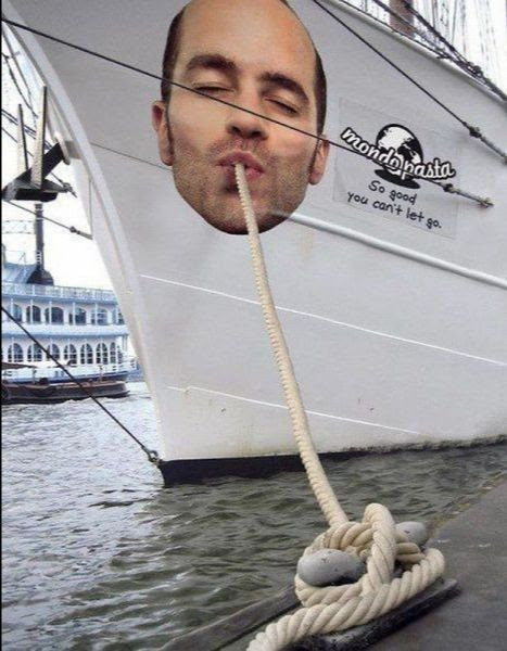 Mondo Pasta: Connecting existing form to vividly convey brand function
Sometimes all you need is to look around you, find a single detail in nature, and leverage its form properties to bring to life your message on a whole different dimension:
 BMW: The simple act of reframing a natural form, into a brand message
Sometimes you use different parts of one element but overlay them with different functions:
 Ecell IIT Guawahti: Leveraging form to drive various functions
For my book cover, I worked with designer Penny Raile to align the design of medieval illuminated scripts that are traditionally detail-rich with the Total Acuity theme of the book for two distinct functions:
First, amplifying the importance of meaningful details for effective visual storytelling, and second, leveraging this medieval design's unique aura of classic parables with strong morals which jive with the book's short stories format.
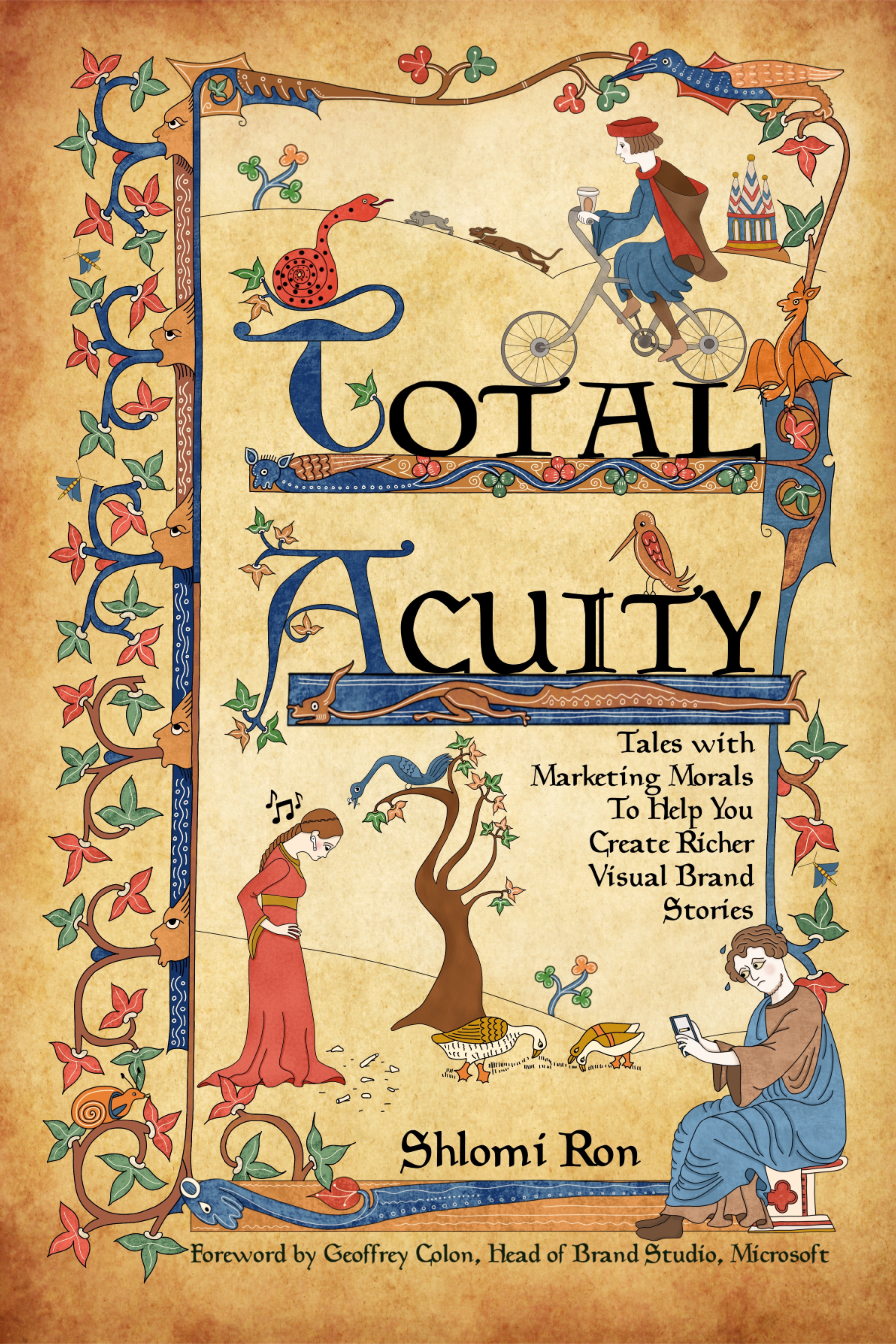 Total Acuity: Form that meets two brand functions
I bet you can find a ton of other examples of this approach from ads, architecture, clothing, and other product design categories. Once you get this principle, you'll start spotting these examples everywhere :)
Yes, you can apply this principle to other visual formats
Although I shared only photos, this approach can also be applied to any other visual formats like video (see Ikea example), this recent interactive billboard from Netflix, infographics, and even a blog: check out a story I published back in 2014 and another from 2017.
***
So, when you think of ways to create a memorable visual story, consider finding these unlikely encounters where a stranger form meets a branded function, follows it, and then takes it for a memorable adventure.
Hey, that sounds a whole lot like a classic story structure right there!
In a nutshell, start first by understanding your brand purpose or key message you want to convey.
Then with your brand function in mind, be on the lookout for existing shapes, patterns, or movements, that share the same visual properties of your brand message.
In case you wondered, the narrative principle behind the Form Meets Function is also called "Unlikely Combinations" which is why it makes your visual story stickier.
Need help developing your brand's visual storytelling strategy? Let's chat!
More articles
