How to Make Effective Infographics that Tell a Story
How to Make Effective Infographics that Tell a Story https://www.visualstorytell.com/wp-content/uploads/2017/06/infographic_thumb.png 368 217 Brian Wallace https://secure.gravatar.com/avatar/77e568a84f83c164ea5edb3a0a0d462bf366fe66ed0faa53fec9cf7958e7430f?s=96&d=mm&r=g
Watch my video recording on the
Visual Storytelling Today show:
On the road?
You can also listen to my audio podcast of this episode.
Subscribe to the Visual Storytelling Today podcast on iTunes or Google Play
Infographics have become one of the fastest growing tactics savvy visual marketers use today. In fact, the effectiveness rating for infographics rose more in one year than any other tactic—from 50 percent to 58 percent, according to the 2016 study by the Content Marketing Institute.
What’s in an Infographic?
We hear about infographics all the time in the digital marketing world, but unfortunately, many people are using the word incorrectly.
“An infographic is not a chart or a collection of graphs – it tells a story in a visual manner that makes difficult topics easier to digest for readers.”
-Brian Wallace
This particular type of visual storytelling can have a lot of benefits for brands in marketing campaigns by giving consumers content they want and building relationships instead of hard-selling.
There are several kinds of infographics:
 Click to view entire infographic
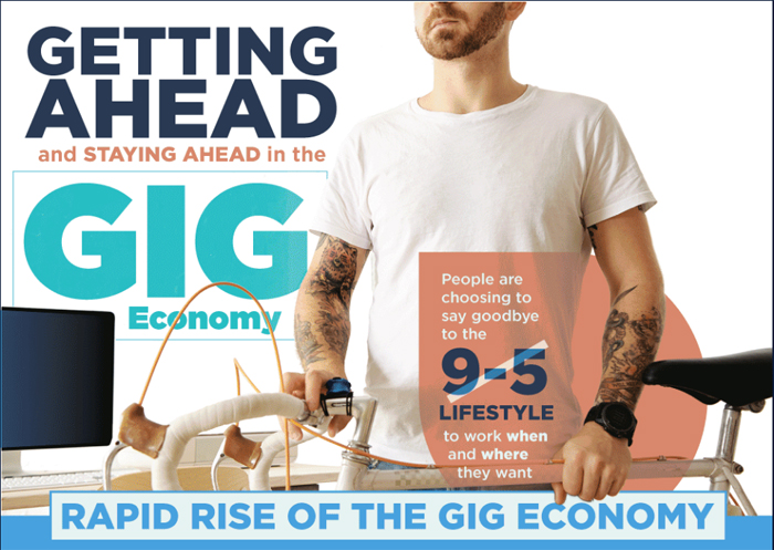
1) Static infographics that start with an idea and then uses visuals and snippets of text to tell a story. A good example of that is the above infographic about the gig or freelance, economy which starts by talking about the growth in freelancing and ends with tips for freelancers to help them do well.
 Click to view entire infographic
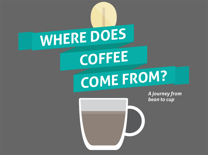
2) Interactive infographics like this one which explains where coffee comes from through a series of moving pictures and text that lead you through the process as you scroll down. It’s a fun way to get people interested in a topic, and content like this tends to get your company a lot of attention.
How to effectively distribute your infographics
![Cannabis as Medicine [INFOGRAPHIC]](https://www.visualstorytell.com/wp-content/uploads/2017/06/infographic3.jpg) Click to view entire infographic
Click to view entire infographic
Infographics tend to get shared a lot, not just on social media, but also through news stories relating to the topic. We recently had the above infographic get shared on over 100 different websites! When you create a high-quality, well-researched infographic you can share it with reporters as a news source that they can then use as a springboard for or complement to their next article on the topic.
To get started, follow these 3 tips
- Value-first: You have to be careful here, however- creating an infographic that doesn’t contribute value to the conversation is likely to fall flat.
- Make it useful to them: Focus instead on giving people something they can use instead of talking about your company’s latest whitepaper.
- Avoid talking about your company: The objective is to get more eyes on your company, and the best way to make sure that doesn’t happen is to only talk about your company.
Want to Know More?
At the top of this page, you can watch my full interactive video interview or if you’re on the road you can listen to my session on Visual Storytelling Today podcast, done on June 29th. I chatted about the power of infographic marketing leveraging narrative visuals and you’re going to want to hear this.
***
Looking for a custom Visual Storytelling
workshop around your product/service?
Schedule a FREE conversation


Dawn Hyman
Brian,
I could not agree more with your post – thank you! With a degree and background in marketing and working for the public sector, the infographics I design not only tell a story, but inform, educate and spark conversations that will support more informed decision making efforts towards effective and efficient service delivery. Data and information can be extremely overwhelming and complex in the public sector and I believe that infographics are an excellent tool to help make sense of it (if designed correctly of course). I have also learned in designing infographics that being astutely aware of your audience can also help to shape the story as well as its visual elements.
Again, great post!